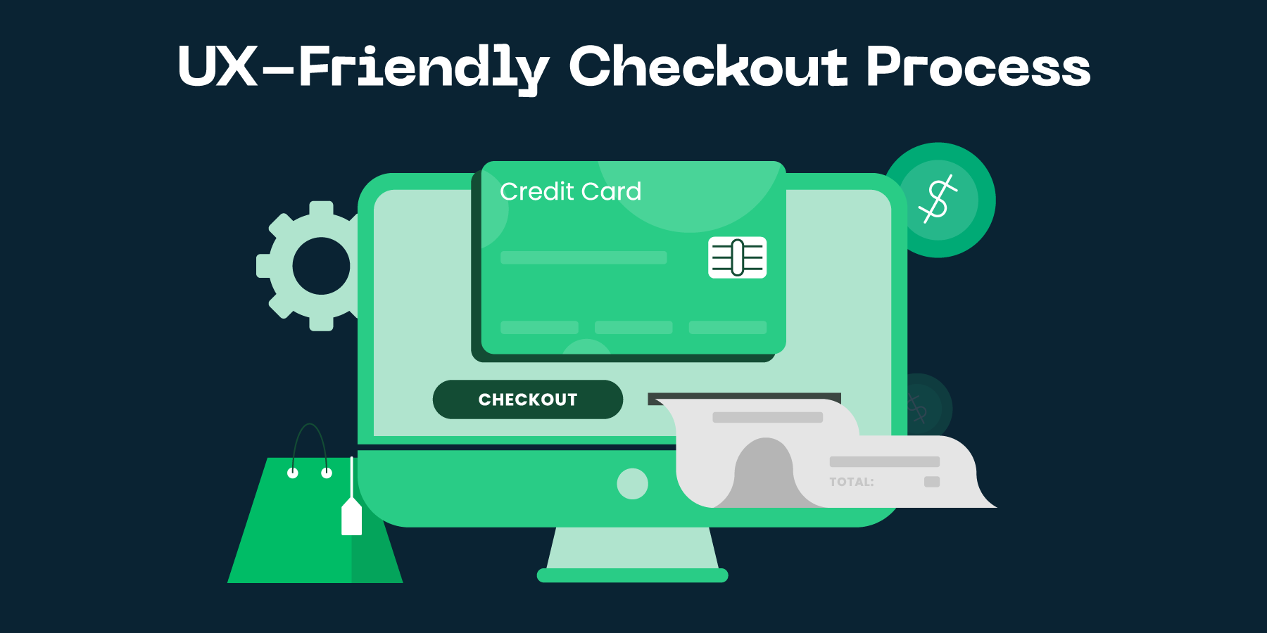
Best Checkout UX Practices for Higher Ecommerce Conversions

Importance of UX-friendly Checkout Process
Understanding UX
Understanding UX, or User Experience, is crucial for any ecommerce business. Essentially, UX involves the entire experience a customer has with your online store, from the moment they land on your homepage to the second they complete a purchase. The more seamless and intuitive this process is for the user, the higher the likelihood of them completing a purchase, returning to your store, and even recommending it to others. UX is not just about aesthetics or how nice your website looks; it's also about functionality and ease of navigation.
The checkout process is particularly important when it comes to UX. It's the final hurdle customers need to cross before a sale is made. And unfortunately, it's also where a lot of potential sales are lost. A clunky, complicated, or confusing checkout process can be enough to make customers abandon their carts and leave your store. To prevent this, a UX-friendly checkout process is absolutely essential.
Remember, in the world of ecommerce, user experience is not just a part of customer service — it's the very foundation of it. By optimizing your checkout process with UX in mind, you're not just making it easier for customers to buy from you, you're also showing them that you value their time and business. And in the competitive world of online shopping, that can make all the difference.
Why UX Matters in Checkout Process
In the competitive world of ecommerce, every little detail matters when it comes to converting a browser into a buyer. And when it comes to sealing the deal, your checkout process can make or break the sale. That's where User Experience (UX) comes into play. An UX-friendly checkout process is not just a nice to have, it's an absolute necessity. It directly impacts your conversion rate, customer satisfaction and ultimately, your bottomline.
The principle behind a UX-friendly checkout process is quite simple: make it as easy and frictionless as possible for the customer to complete their purchase. The fewer clicks, the better. The less confusion, the better. This involves a clear, intuitive design and a smooth, seamless flow from shopping cart to order confirmation. It's about prioritizing customer's ease and convenience over everything else.
Remember, a frustrating checkout process can quickly drive customers away, even those who are very interested in your products. On the other hand, a well-designed, UX-friendly checkout process can not only boost conversions but can also increase customer loyalty and repeat purchases. In other words, it's an investment that can pay off in a big way.
How to Determine if Your Checkout Process is UX-friendly
Evaluate the Simplicity
One of the key aspects to evaluate in your checkout process is its simplicity. A complex checkout process can confuse your customers, leading to cart abandonment. This complexity can come in various forms, such as requiring too many steps to complete the purchase, having an overly complicated design, or asking for an excessive amount of information. The best way to achieve simplicity is by streamlining the process and only asking for necessary information.
When evaluating the simplicity of your checkout process, consider factors such as the number of steps involved, the ease of navigation, and clarity of instructions. For instance, a simplified checkout process might include a progress indicator to let customers know how far they are from completion. Another good practice is to offer guest checkout options, as forcing users to create an account can be a major deterrent. Reducing clutter and using clear, concise language can also substantially improve the user experience and encourage more conversions.
Remember, a user-friendly checkout process is not just about aesthetics. It's about making the process as efficient and easy-to-understand as possible. By focusing on simplicity, you can create a checkout process that minimises customer frustration and maximises conversions.
Check for Consistency and Predictability
One key factor to consider when evaluating your checkout process is the consistency and predictability of the experience. If your ecommerce site’s checkout process varies greatly each time a customer makes a purchase, this inconsistency can be confusing and may even discourage future purchases. A consistent checkout experience, on the other hand, breeds familiarity and trust.
Consistency refers to maintaining the same layout, design elements, and flow across the entire checkout process. This includes everything from the shopping cart to the final payment confirmation page. For instance, if the "Proceed to Checkout" button is in the upper right corner on one page, it should not suddenly move to the lower left on the next.
Predictability is about setting and meeting user expectations throughout the checkout experience. If a user clicks on a button that says "Finalize Purchase", they should be taken to a confirmation page, not redirected to view other products. Unexpected actions can confuse customers and lead to unnecessary abandonment of the shopping cart. Therefore, always strive to make your checkout process as predictable as possible to increase customer satisfaction and conversion rates.
Common Issues in Checkout Process UX
Unnecessary Steps
A common issue in checkout process UX is the inclusion of unnecessary steps. If the checkout process is too long or complicated, chances are high that potential customers will abandon their shopping carts mid-way. This can significantly impact your conversion rates in a negative way. Each additional step presents a new opportunity for a customer to change their mind or become frustrated with the process. Simplicity is the key here - the less steps, the better.
Unnecessary steps could include asking for redundant information or requiring registration before checkout. For instance, there's really no need to ask customers for their work phone number or fax number. Such superfluous fields only serve to frustrate the user and prolong the checkout process. Similarly, forcing users to create an account before they can purchase can also be a major deterrent. It's essential to understand that the primary goal is to facilitate users in making a purchase, not to gather as much information as possible or inflate your registered user base.
In summary, eliminating unnecessary steps is a crucial aspect of creating a user-friendly checkout process. Streamlined, straightforward checkout processes that respect the user's time and effort are more likely to result in completed purchases and return customers. So, take a good look at the steps your customers must go through to make a purchase - There might be some steps that are not needed at all.
Lack of Transparency in Costs
One of the most common issues in checkout process UX is the lack of transparency in costs. This typically refers to hidden costs that are only revealed to the customer at the very end of the checkout process. In many cases, these can be shipping fees, taxes or other additional charges that are not clearly stated upfront. This lack of transparency not only frustrates customers but can also lead to cart abandonment, significantly affecting your store's conversion rate.
As an ecommerce store owner or marketer, it's crucial to ensure that all costs associated with a purchase are clear from the start. This includes item prices, shipping costs, taxes, and any other additional charges. Having a transparent pricing strategy not only improves the checkout process UX but also helps build trust with your customers. When customers know exactly what they're paying for and why, they're more likely to complete their purchase and even become repeat customers.
It's equally important to avoid last-minute cost surprises during the checkout process. If additional charges are necessary, ensure that they are communicated early on in the process, ideally on the product page itself, so customers are not taken aback when they get to the final checkout page. Remember, transparency is key in building a successful ecommerce business and keeping your customers happy.
Top Tips for a UX-friendly Checkout Process
Simplify and Streamline
One essential principle to remember when designing a UX-friendly checkout process is to simplify and streamline. A complicated checkout process can serve as a barrier for potential customers, discouraging them from completing their purchase. It's important to eliminate unnecessary steps and ask only for the information that is truly necessary. This can significantly improve your store's conversion rate by making the purchasing process quick, easy, and hassle-free.
For example, rather than requiring customers to create an account before they can make a purchase, consider offering a guest checkout option. While capturing customer data is important, it's equally essential to recognize that some customers prefer a quick, no-strings-attached shopping experience. Additionally, try to minimize the amount of typing required by incorporating drop-down menus where possible and auto-filling information whenever possible.
Remember, the ultimate goal is to reduce friction and make the process as user-friendly as possible. By simplifying and streamlining the checkout process, you'll not only increase your conversion rate, but also improve customer satisfaction. It's a win-win situation.
Provide Clear Pricing and Shipping Information
One of the key factors that can significantly enhance your checkout process UX is providing clear pricing and shipping information. Nothing frustrates an online shopper more than unexpected costs popping up at the last minute in the checkout process. This often leads to cart abandonment and diminished customer trust. It is, therefore, crucial to ensure all costs, including taxes, shipping, and any other fees, are transparently displayed from the beginning of the shopping journey. This builds customer trust and encourages them to complete their purchases.
Similarly, clear and detailed shipping information can significantly improve a user's checkout experience. In addition to displaying the shipping costs upfront, provide a range of delivery options that cater to different needs and budgets. If possible, offer express delivery for those who need their items urgently, and a more economical option for those who are happy to wait. This level of transparency and flexibility not only enhances the checkout UX but also helps to foster customer loyalty as they feel valued and understood.
In conclusion, whilst it might seem like a minor detail, the impact of clear pricing and shipping information on the checkout process UX cannot be overstated. By providing this transparency, you not only improve the user experience, but also increase the likelihood of conversion and customer retention. It's a win-win situation for both your business and your customers.
How ConvertMate Can Help
Our Approach to UX Optimization
At ConvertMate, we believe in the power of a seamless, user-friendly checkout process when it comes to ecommerce success. Our approach to UX optimization centers around making your online store not just visually appealing, but also intuitively navigable for your customers. We understand that a smooth, hassle-free shopping experience can significantly drive up conversion rates and boost customer loyalty in the long term. That's why our strategies are focused on creating a checkout process that is straightforward, quick, and secure.
We start by analyzing your current checkout process to identify potential UX roadblocks that might be causing cart abandonment. From slow loading times to complicated navigation, we root out all the issues that might be hurting your conversions. Once these issues have been identified, we use data-driven insights to guide our UX redesign process, ensuring that each change we make aligns with your customers' needs and preferences.
Remember, the checkout process is not just the final step in the customer journey, it's also a crucial touchpoint that can make or break the shopping experience. That's why at ConvertMate, we don't just optimize your checkout process - we make it a memorable part of the customer journey that encourages repeat purchases and fosters brand loyalty.
Benefits of Using ConvertMate for Your Checkout Process UX Optimization
Utilizing ConvertMate as an integral part of your online store's checkout process can vastly improve the user experience (UX) and ultimately increase conversion rates. With its unique features such as automated currency conversion and language translation, it simplifies the checkout process for your customers, reducing friction and improving their overall shopping experience. This ease of use is vital in creating a positive UX, as customers are more likely to abandon their carts if the checkout process is too complicated or time-consuming.
Automated Currency Conversion
One significant benefit of using ConvertMate is its ability to automatically convert prices into the customer's local currency. This takes away the hassle for your customers of having to manually calculate the cost of their purchases, increasing the likelihood of them completing the checkout process. Furthermore, showing prices in a customer's local currency can create a sense of familiarity and trust, which can in turn improve your conversion rates.
Language Translation
ConvertMate's language translation feature is another way it can significantly enhance your checkout UX. By automatically translating your checkout page into the customer's native language, it eliminates any potential confusion or misinterpretation that could occur due to language barriers. This ensures that your customers fully understand the checkout process and what they're purchasing, leading to increased customer satisfaction and a greater chance of them completing their purchase.