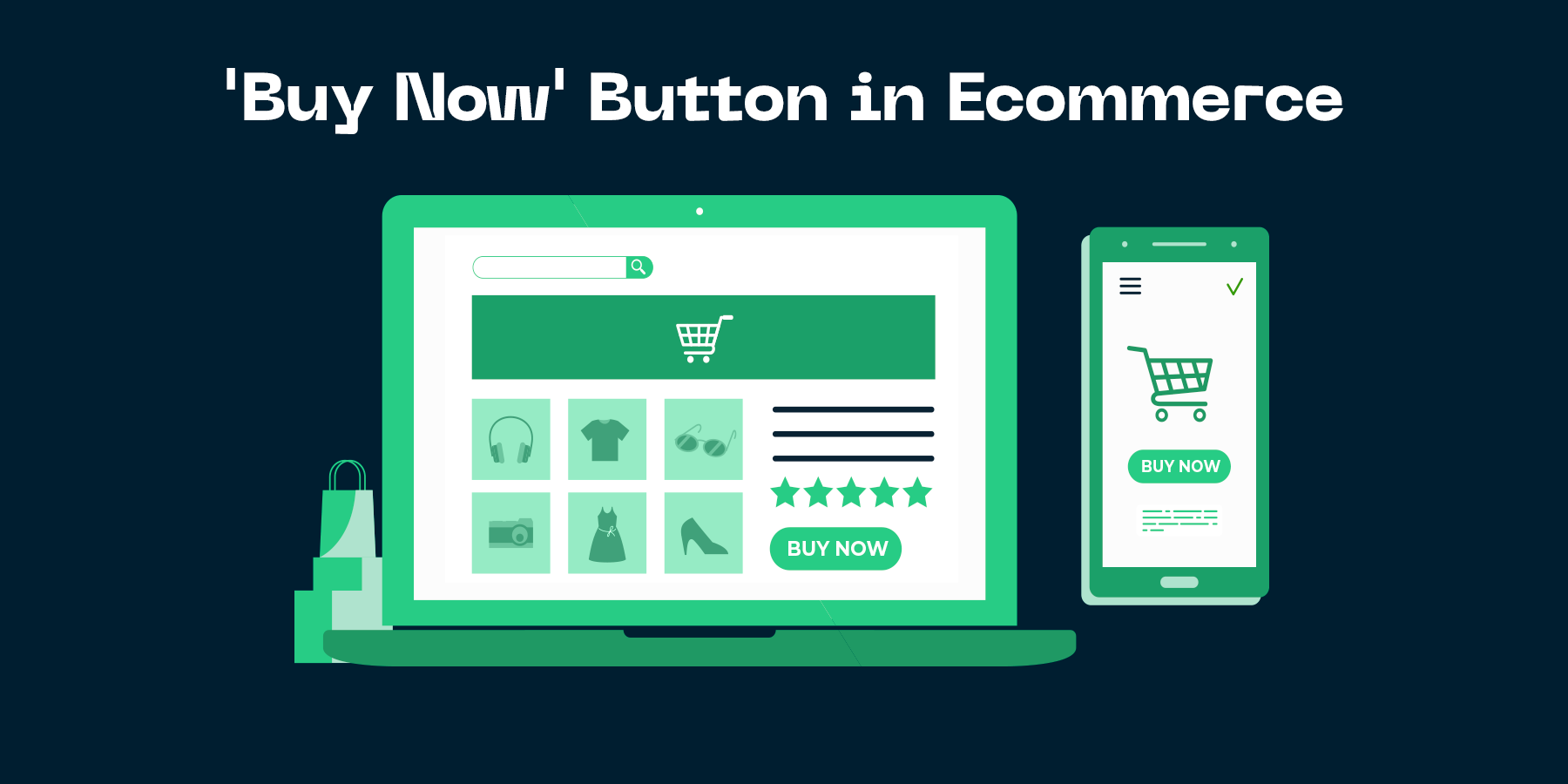
The Simple Science of a Converting 'Buy Now' Button

Understanding the Importance of a Converting ’Buy Now’ Button
Significance of a Converting ’Buy Now’ Button
At the heart of any successful ecommerce store is a converting ’Buy Now’ button. It is the final trigger that motivates a potential customer to become a paying customer. Its importance cannot be overstated, especially in an environment where competition is intense and customer attention span is short. A well-designed and prominently placed ’Buy Now’ button can significantly increase the conversion rate of your ecommerce store.
The science of a converting ’Buy Now’ button lies in its ability to attract and persuade. It should be visually appealing and clearly visible. It should also be compelling enough to convince the potential customer to complete the transaction. An ecommerce store owner or marketer should understand the psychology of color, design and placement to create an effective ’Buy Now’ button. In essence, the ’Buy Now’ button is the tipping point that can influence a customer’s purchasing decision.
Understanding the importance of a converting ’Buy Now’ button is a critical part of your ecommerce strategy. It’s not just about having a button on your website, but about optimizing it to maximize conversions. Many factors such as color, size, position, and wording can significantly impact the effectiveness of your ’Buy Now’ button. By grasping this simple science and implementing it correctly, you can significantly boost your store’s conversion rate and ultimately increase your revenue.
The Influence of a ’Buy Now’ Button on Conversion Rates
In the world of ecommerce, the power of a "Buy Now" button cannot be overstated. This small but impactful element on your page holds the potential to dramatically increase your conversion rates. As an ecommerce store owner or marketer, understanding and harnessing the influence of a converting "Buy Now" button is crucial to your success.
A well-designed and strategically placed "Buy Now" button acts as a clear call-to-action (CTA), guiding your customers towards making a purchase and reducing cart abandonment rates. It plays a decisive role in the customer’s journey by creating a sense of urgency and eliminating any potential confusion or complications that could deter a customer from completing a purchase.
In essence, the "Buy Now" button is much more than just a clickable element on a page - it is a powerful tool that, when used effectively, can significantly boost your conversion rates. Therefore, taking time to optimize this feature can yield substantial returns for your ecommerce business.
The Science Behind a High Converting ’Buy Now’ Button
Psychology of a ’Buy Now’ Button
The Psychology of a ’Buy Now’ Button is an intriguing and complex field of study, deeply intertwined with the consumer’s decision-making process. The ’Buy Now’ button, being the final checkpoint before a sale, has the power to make or break the conversion journey. Leveraging cognitive biases and psychological triggers can significantly enhance the effectiveness of this button, leading to an increased conversion rate.
Colors, text, placement, and size of the ’Buy Now’ button are all vital elements that can psychologically influence a buyer’s decision. For instance, a red button might trigger urgency or importance, while a green one could denote safety or affirmation. The button’s text also plays a significant role. Phrases like ’Purchase Now’ can feel less pushy and more inviting than a simple ’Buy Now’. The aim is to make the customer feel comfortable and confident in their purchase decision and not forced or rushed.
Beyond design aspects, the strategic placement of the ’Buy Now’ button can also enhance conversion rates. Placing it right after outlining the benefits of the product or service can capitalize on the consumer’s heightened interest level. Also, making sure the button stands out prominently on the page and is easy to locate can create a smooth shopping experience. In summary, understanding and leveraging the psychology of a ’Buy Now’ button can effectively guide your customer’s journey, potentially leading to higher conversions for your ecommerce store.
Impact of Colors and Shapes on ’Buy Now’ Buttons
Understanding the impact of colors and shapes on "Buy Now" buttons is a crucial aspect of conversion rate optimization. While it might seem trivial, research has shown that these visual elements can significantly influence buyer decisions. Colors evoke certain emotions and psychological responses. For instance, red is associated with urgency, making it an excellent choice for clearance sales. Blue, on the other hand, is often linked to trust and security, making it ideal for businesses aiming to build customer trust.
When it comes to shapes, it's also essential to consider the cultural and psychological implications. Rounded shapes are generally perceived as more inviting and comforting, while square or rectangular buttons might be viewed as more stable and reliable. The choice between a sharp-edged button and a rounded one can affect the user's perception of your brand and influence their purchasing decision.
The key, however, is to ensure that the colors and shapes you choose align with your brand identity and resonate with your target audience. Conducting A/B testing can provide valuable insights into what works best for your specific market. Remember, there's no one-size-fits-all answer. What works for one ecommerce store may not necessarily work for another. By understanding the science behind a high-converting "Buy Now" button, you will be better equipped to create an effective, compelling call-to-action that drives conversions and boosts your bottom line.
Data-Driven Approach to Optimize ’Buy Now’ Button
Using Data Analysis for Button Optimization
In an increasingly competitive ecommerce landscape, it’s crucial for business owners and marketers to leverage data analysis for button optimization. The concept involves using data-driven insights to improve the overall design, placement, and functionality of the ‘Buy Now’ button on your ecommerce site. A well-optimized button can significantly enhance the user experience, boost conversion rates, and ultimately drive higher revenue for your business.
Adopting a data-driven approach to the ’Buy Now’ button optimization entails a thorough analysis of various factors influencing user behavior. These include button size, color, text, placement, and more. By analyzing data from A/B testing, heat maps, click-through rates and other analytics, you can gain valuable insights into what encourages or discourages users from clicking the ’Buy Now’ button.
It’s essential to understand that the ’Buy Now’ button is not just a functional element, but a powerful call-to-action (CTA) that can significantly influence your customers’ purchasing decision. Therefore, any changes to its design or positioning should be backed by solid data and not by mere assumptions or personal preferences. Remember, what may seem visually appealing might not always result in desired conversions. Hence, let the data guide your decisions in optimizing the ’Buy Now’ button for better conversions.
Role of AI in Button Optimization
The realm of digital commerce has shifted dramatically with the advent of Artificial Intelligence (AI). One of the key roles of AI is in the optimization of website elements like the "Buy Now" button. This significant tool in the sales funnel is no longer just a static feature. With AI algorithms, it can be optimized based on data derived from customer behaviors and preferences. The result is a dynamic, personalized, and thus, more effective ’Buy Now’ button.
AI algorithms work through the continual collection and processing of user data. They analyze users’ interaction with the ’Buy Now’ button, their browsing patterns, time spent on the page, and more. Based on these insights, AI proposes changes to the button – it could be a different text, color, size, or position on the page to make it more appealing and noticeable to the customer. Through this data-driven approach, ecommerce store owners and marketers can significantly increase conversion rates.
AI not only facilitates a personalized shopping experience but also simplifies decision-making. It takes the guesswork out of optimization and saves significant time and resources. Store owners and marketers can rely on AI to apply the simple science of conversion and make the ’Buy Now’ button a powerful tool in driving sales.
How to Create a Converting ’Buy Now’ Button
Best practices for designing a ’Buy Now’ Button
A successful ’Buy Now’ button is more than just a simple call-to-action; it is a decisive point in the customer’s journey. The design, color, and wording of this vital feature can greatly impact your conversion rates. One of the best practices for designing a ’Buy Now’ button is to make it stand out from the rest of your page. This can be achieved using a contrasting color that does not clash with the overall design of your website. The size of the button also matters. It should be large enough to be easily clicked on, especially on mobile devices, but not so large that it overwhelms other content.
The wording on your ’Buy Now’ button is equally important. It should clearly and concisely convey what will happen when a customer clicks on it. Avoid vague phrases like ’Proceed’ or ’Continue’. Instead, opt for direct and action-oriented phrases like ’Buy Now’ or ’Add to Cart’. The key here is to eliminate any ambiguity and make the purchasing process as straightforward as possible.
Remember, the goal is to make the buying process simple and seamless for your customers. Test different designs, colors, and wordings to see what works best for your audience. Ultimately, a well-designed ’Buy Now’ button can significantly boost your conversion rates and increase your revenue. So, invest time and thought into its design and reap the rewards of a more profitable ecommerce store.
Incorporating Urgency into Your ’Buy Now’ Button
The power of urgency cannot be underestimated in the realm of ecommerce. By incorporating a sense of urgency into your "Buy Now" button, you can significantly increase your conversion rates. Urgency creates a psychological trigger that motivates potential buyers to make faster decisions. The fear of missing out on a good deal can be a powerful motivator, driving users to click on the "Buy Now" button before the deal is over.
How can you incorporate urgency effectively? There are various strategies to give your "Buy Now" button an urgency feel. One of the most effective ways is by adding a countdown timer next to the button. This conveys a clear message that the time to purchase is limited. Another method is by showing the limited stock availability for a product, encouraging the user to buy before the stock runs out. Phrases like "Only 3 items left" or "Offer ends in 2 hours" can boost the sense of urgency. Remember, the goal is to motivate the user to act immediately.
However, it’s important to use these techniques judiciously. Overusing urgency can make your tactics seem insincere and could potentially harm your brand reputation. The key is to create genuine urgency that aligns with your product or service offering. In conclusion, incorporating urgency into your "Buy Now" button can be a game-changer in your conversion rate, if done correctly.
Case Studies of Successful ’Buy Now’ Button Optimization
Brand A’s Success Story
One of the most striking success stories in optimizing a "Buy Now" button is that of Brand A. Their journey towards increasing their conversion rate is nothing short of inspiring. Brand A initially had a dull and uninspiring "Buy Now" button, which struggled to attract any attention. Furthermore, the button was located far down the page, making it a struggle for visitors to find. These factors contributed to a low conversion rate.
The turning point for Brand A came when they decided to revamp their "Buy Now" button. By applying the simple science behind a converting "Buy Now" button, the company managed to drastically increase their conversion rates. The key was to make the button more visible and appealing. They increased the size, changed the color to a more eye-catching one, and moved the button’s location to a more prominent place on the page.
Opinion: This case study clearly demonstrates that small changes can have a significant impact on conversion rates. It’s not just about having a "Buy Now" button, but using the right techniques to optimize it. Brand A’s success story should be a motivation for ecommerce store owners and marketers to critically analyze their own "Buy Now" buttons and seek ways to improve them. Every business should understand the simple science behind a converting "Buy Now" button. It’s an essential tool for increasing conversions and growing your business.
Brand B’s Success Story
One of the most compelling testaments to the power of a well-optimized "Buy Now" button is the success story of Brand B. This ecommerce brand made a strategic decision to intensify their focus on the design, placement, and overall optimization of their "Buy Now" button, and the results were truly spectacular.
Brand B initially made a simple but impactful change: they altered the color and size of their "Buy Now" button to make it more visible and enticing. By making it visually more prominent and impossible to miss, they saw a significant increase in their conversions. But they didn’t stop there. Brand B then decided to tackle the button’s copy and found that even seemingly minor text changes can make a big difference. They tested various phrases and found that a more assertive language, like "Purchase Now", led to a further increase in conversions.
Brand B’s story is a valuable lesson in the power of continual optimization. It’s about understanding that the smallest details can often make the biggest impact. If you’re an ecommerce store owner or marketer, it’s certainly something to think about and, more importantly, test within your own site. The "Buy Now" button may just be a small component of your website, but its potential impact on your revenue and bottom line is anything but minor. As Brand B found, small changes can yield significant results, making the science of a converting "Buy Now" button a worthy focus for any ecommerce business.