Understanding the Psychology Behind an Effective Add to Cart Button for eCommerce Success

Understanding the Importance of the Add to Cart Button
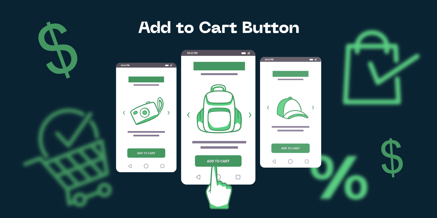
The Role of the Add to Cart Button in eCommerce
In the realm of eCommerce, the "Add to Cart" button plays a crucial role that extends far beyond being a mere feature on a webpage. It serves as a powerful call-to-action (CTA) that drives user engagement, fosters customer conversion, and ultimately propels online sales. As such, understanding its psychological impact on shoppers is key to eCommerce success.
From a psychological viewpoint, the "Add to Cart" button triggers a sense of commitment in the shopper's mind. When a customer clicks on this button, they are making a conscious decision to move a step closer to the purchase, thereby increasing their investment in the process. This psychological commitment, as facilitated by the "Add to Cart" button, is a potent tool for converting site visitors into paying customers.
Therefore, the design, positioning, and language of the "Add to Cart" button matter significantly. It should be visually appealing and strategically placed to grab attention and encourage action. Its messaging should be clear, persuasive, and should create a sense of urgency, subtly nudging the shopper towards a purchase. In essence, the "Add to Cart" button is more than just a functional element; it is a strategic tool for influencing customer behavior and driving eCommerce success.
Why the Add to Cart Button is Critical for Conversion
The Add to Cart button is a pivotal element in eCommerce websites. It acts as a gateway that leads the customer from mere browsing to actual purchasing. This simple tool, if effectively designed and placed, can significantly boost your conversion rates. The psychology behind it is simple yet powerful - it prompts an action, creating a sense of ownership and investment in the potential buyer, and paves the way for a smoother checkout process.
Understanding the importance of the Add to Cart button begins with acknowledging its role as a call to action (CTA). Its design, color, and placement can largely influence a buyer's decision to proceed with the purchase. The button should be easy to find, attractive, and intuitive. If it's too small, hard to see, or confusing, customers may abandon their purchase journey, leading to decreased conversions.
Moreover, the Add to Cart button should create a sense of urgency and exclusivity. Phrases like "Limited Stock" or "Get Yours Now" can trigger an emotional response, nudging customers to act quickly. It's not just about having an add to cart button - it's about making it effective. In essence, the Add to Cart button is more than just a functional feature, it's a strategic tool that can help eCommerce store owners or marketers significantly improve their overall conversion rate.
The Psychology Behind an Effective Add to Cart Button
The Influence of Color and Design
The influence of color and design in eCommerce cannot be underestimated, particularly when it comes to the all-important "Add to Cart" button. This button is one of the most critical elements of your online store. Its design, color, and positioning can significantly impact your conversion rates. The psychology behind the effectiveness of this button is rooted in human subconscious reactions to visual stimuli.
Color plays a vital role in psychology. Different colors evoke different types of responses. For instance, red is typically perceived as a color of urgency and excitement, which can encourage impulse buying. On the other hand, blue often conveys trust and stability, which can be pivotal in encouraging customers to complete their purchase. Therefore, choosing the right color for your "Add to Cart" button can drastically influence your customers' buying behavior and enhance conversion rates.
The design of your "Add to Cart" button is equally significant. It should be large enough to be easily noticeable but not overwhelming. The button should be designed to stand out from the other elements on the page, yet blend in harmoniously with the overall website's design. Its position on the page is also crucial. Ideally, it should be placed near the product details or just below it, which makes it easy for the customer to proceed with the purchase. To maximize your eCommerce success, it's essential to understand and apply these psychological principles into your website design.
The Impact of Placement and Size
Understanding the psychological impact of placement and size in relation to the 'Add to Cart' button on an eCommerce site can significantly improve conversion rates. A well-placed and appropriately sized button can subconsciously draw the potential buyer's attention, and prompt them to take the desired action. Contrarily, a poorly placed or size inappropriate button can confuse or deter a site visitor, thereby reducing the likelihood of conversion.
Placement: The positioning of the 'Add to Cart' button plays a vital role. The button should be located where the user naturally navigates or where their gaze naturally falls. Generally, it is best to place this button near the product details or just below the product image. This simplifies the process for the customer, thereby increasing the chances of purchase. Contrarily, placing the button too far from the product details can confuse the customer, making it less likely that they will complete the purchase.
Size: The size of the 'Add to Cart' button should be large enough to catch the eye, but not so large that it looks out of proportion or overbearing. An ideally sized button is one that is noticeable without being obnoxious- it should be big enough to stand out, but not so big that it distracts from other useful information on the page. A well-sized 'Add to Cart' button strikes a balance, enabling the user to spot it easily, without feeling pressured or overwhelmed.
Decoding the Science of Conversion Optimization
The Importance of A/B Testing
A/B testing, also known as split testing, is a crucial tool in the world of conversion optimization. This method allows eCommerce store owners and marketers to compare two versions of a web page, email, or other customer touchpoints to determine which performs better. In essence, A/B testing serves as a scientific, data-driven means to understand customer behaviors and preferences, thereby significantly boosting conversion rates.
When it comes to the science of conversion optimization, A/B testing is an integral part of understanding the psychology that drives customer actions on your eCommerce site. Especially when you are contemplating the effectiveness of an "Add to Cart" button, A/B testing can provide invaluable insights. For example, it can reveal whether a green or red button gets more clicks, or if a button labeled "Buy Now" performs better than one labeled "Add to Cart". This information is vital in creating a more user-friendly experience that nudges customers towards completing a purchase.
Remember, each element on your website, no matter how small, can impact your conversion rates. It's vital to make data-driven decisions, and that's where A/B testing becomes a game-changer. The importance of A/B testing cannot be overstated; it's a surefire way to decode customer psychology and optimize your eCommerce store for success.
How Data Analysis and AI Can Optimize the Add to Cart Button
Data analysis and AI have proven to be essential tools in optimizing the "Add to Cart" button for eCommerce platforms. They play a crucial role in understanding customers' behavior and preferences. By analyzing data collected from users' interaction with the site, AI can identify trends and patterns that can help in enhancing the effectiveness of the "Add to Cart" button. Factors like color, size, placement, and wording of the button can significantly influence the user's decision to add a product to the cart, and AI can help determine the most effective combination of these factors.
Decoding the Science of Conversion Optimization is all about using data and AI to understand what motivates your customers. The power of AI lies in its ability to learn and adapt. It can test different iterations of the "Add to Cart" button and learn from the customers' responses to each variation. This real-time learning and adapting can lead to a continuous improvement in conversion rates. Moreover, AI can segment customers based on their behavior and preferences, allowing for a more personalized shopping experience. For instance, the "Add to Cart" button that works for one customer segment may not work for another. Hence, having AI to customize the button for each segment can significantly boost conversions.
It is clear that data analysis and AI have tremendous potential in optimizing the "Add to Cart" button. By leveraging these technologies, e-commerce store owners or marketers can gain insights into their customers' psychology and make data-driven decisions to enhance their conversion rates. After all, understanding the psychology behind an effective "Add to Cart" button is a critical aspect of eCommerce success.
Case Studies of Successful Add to Cart Button Optimization
How Big Brands Have Optimized Their Add to Cart Button
Big brands such as Amazon and Nike understand the importance of optimizing their add to cart button to increase their conversion rates. They have made use of the psychology behind an effective add to cart button to enhance their eCommerce success. For instance, Amazon uses a bright, contrasting button color that stands out from the rest of the page, which attracts the customers' eyes. Additionally, they use a direct and clear call to action - "Add to Cart", while offering a sense of urgency by informing the user about the remaining stock. This tactic, influenced by the 'scarcity principle', creates a fear of missing out, compelling customers to act quickly.
Nike, on the other hand, takes a slightly different approach. They use a black and white color scheme for their add to cart button which aligns with their overall brand image, reinforcing brand familiarity and trust. Moreover, they use persuasive microcopy like "add to bag", which subtly suggests a sense of ownership to the user. This taps into the 'endowment effect', where people value things more when they feel a sense of ownership over them. Combined with a simple and intuitive design, these techniques significantly contribute to their high conversion rates.
By observing these successful case studies, it's clear that understanding the underlying psychology and implementing strategic design elements in your add to cart button can be a game-changer for your online store's conversion rates. As an ecommerce store owner or marketer, it's essential to consider these factors to achieve eCommerce success.
Successful Conversion Rate Optimization Strategies in eCommerce
Understanding the psychology behind an effective 'Add to Cart' button proves to be a game-changer in eCommerce success. This goes above and beyond merely stamping a generic 'Add to Cart' button on your product pages. The design, positioning, color, and language of your call-to-action button can significantly impact your conversion rates.
Conversion Rate Optimization (CRO) strategies are vital in ensuring that visitors to your eCommerce store turn into customers. For instance, you could consider A/B testing different button colors to see which one gets the most clicks. You might find that a more vibrant color garners more attention. Or you may discover that a softer, subtler hue fits better with your overall web design and brand aesthetic. Don't be afraid to experiment and iterate based on your findings.
Furthermore, the language you use on your button can also influence conversion rates. 'Add to Cart' may work for some, but perhaps 'Buy Now', 'Purchase', or 'Order Here' might resonate better with your audience. Case studies have shown that optimized 'Add to Cart' buttons led to increased click-through rates and overall sales. Therefore, investing time and resources into fine-tuning these buttons to appeal to your target audience's psychology can have a direct impact on your eCommerce success.
Tips and Best Practices for Add to Cart Button Optimization
How to Design an Effective Add to Cart Button
Designing an effective Add to Cart button is crucial for eCommerce success. It serves as a pivotal point in the customer journey, directly influencing conversions and sales. Therefore, optimizing it using a blend of psychology and good design can ensure your eCommerce store sees improved performance.
The first aspect to consider is the color and size of the button. It must be vibrant and prominent, grabbing the user's attention immediately. Colors like red or orange, which are associated with urgency and excitement, have been found effective. The size of the button should be large enough to be easily clickable, especially on mobile devices, but not so large that it distracts from other essential elements on the page.
Next, the positioning of the button matters. It should be placed in a position on the page where it is easily noticeable and accessible. Typically, the right-hand side or directly below the product details is an ideal place. Lastly, wording is crucial. Phrases like "Add to Cart" or "Buy Now" have a directness that encourages action. Make sure the message is clear, concise, and compelling for the visitor to take the desired action.
Remember, an effective Add to Cart button is not just about aesthetics, but also about understanding your user's mind. By combining psychology with design elements, you can optimize this vital component for increased conversions and eCommerce success.
How to Continuously Improve Your Add to Cart Button for Higher Conversions
The psychology behind an effective "Add to Cart" button is an important aspect of eCommerce success. As an eCommerce store owner or marketer, understanding this principle can significantly boost your conversion rate. One of the key elements in optimizing this button is visibility. Your "Add to Cart" button should stand out on the product page and be easily identifiable. It should be in a contrasting color to your website background, and large enough to be easily clicked or tapped.
Another vital factor is simplicity. Overly complicated or flashy buttons might distract and confuse your customers. Stick to simple designs and concise text like "Buy Now" or "Add to Cart". A clean, well-designed button can significantly increase your conversion rates.
Finally, the positioning of your "Add to Cart" button also greatly impacts its effectiveness. It is advised to position it near the product image or directly under the product description. This provides an intuitive experience for your customers, as they naturally expect to find the button in these areas after viewing the product details. Continuously testing and optimizing these aspects of your "Add to Cart" button will ensure your eCommerce success.