Embedded VS Modal: UI/UX Checkout Comparison

Introduction to Checkout UI/UX
Understanding Checkout UI/UX
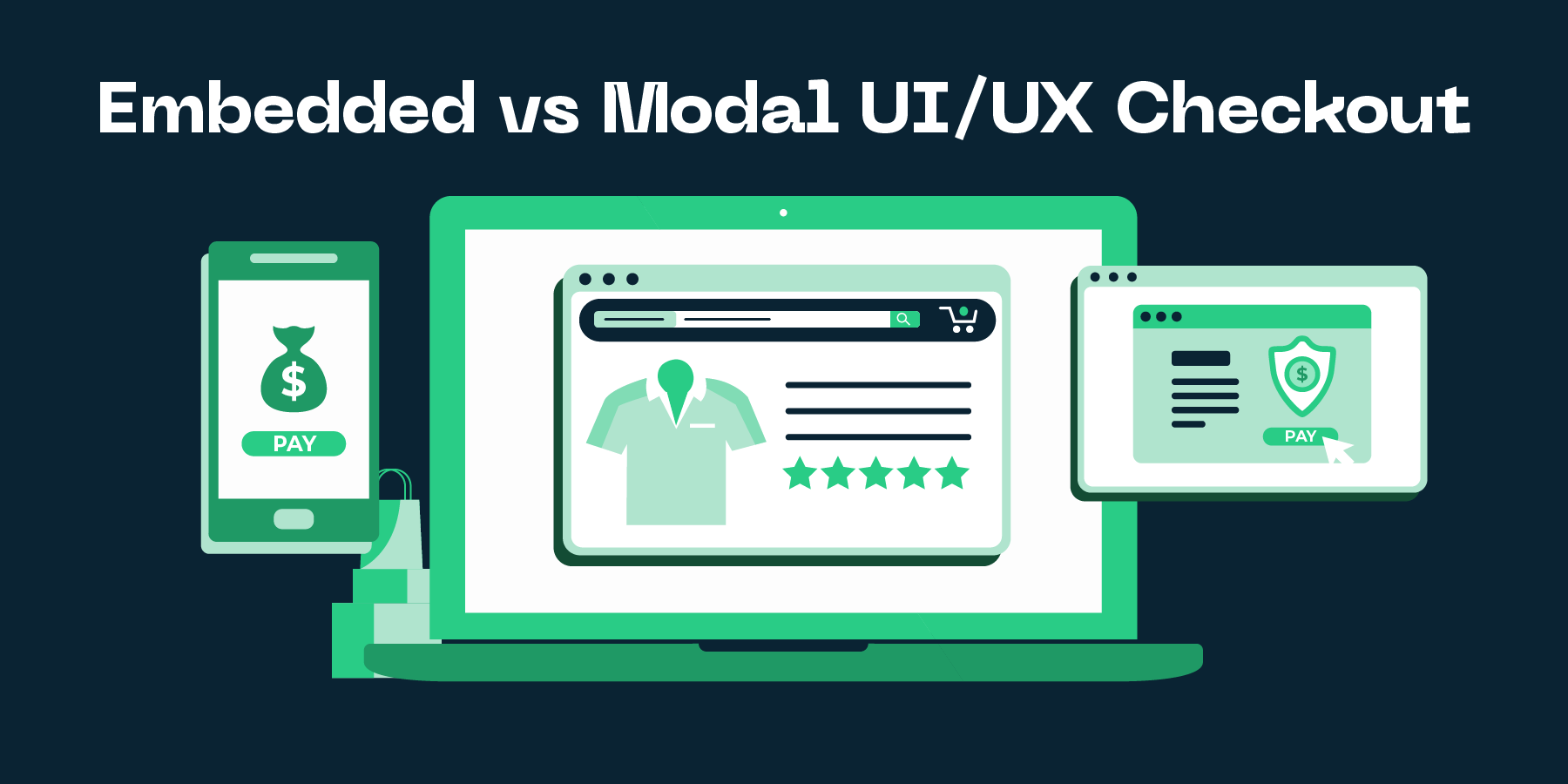
UI/UX, which stands for User Interface/User Experience, is a critical aspect of any ecommerce site and plays a significant role in determining the site’s conversion rate. In the context of the checkout process, UI/UX design refers to how the checkout page is presented to the customer and how the customer interacts with it. This can be done in two main ways: embedded checkout and modal checkout.
Embedded checkout is a seamless process where the checkout is incorporated within the webpage itself. In contrast, modal checkout is a standalone process where the checkout pops up as a separate window. Both these methods have their advantages and disadvantages and making a choice between them often depends on factors such as the nature of your business, your customer base and the complexity of the checkout process.
Understanding the pros and cons of each method is crucial for an ecommerce store owner or marketer. The main goal is to provide a smooth, efficient and hassle-free checkout experience to the customers, which in turn can significantly improve conversion rates. Therefore, you should give due consideration to the UI/UX design of your checkout process, especially when it comes to the embedded vs modal debate, and make an informed decision to optimize your online store’s performance.
Significance of Checkout UI/UX in eCommerce
In the world of eCommerce, the checkout process is of paramount importance. It acts as a crucial touchpoint between the customer and the business, often determining whether a sale is completed or abandoned. The significance of the checkout User Interface (UI) and User Experience (UX) cannot be overstated. An intuitive, user-friendly checkout process can significantly enhance your conversion rates, customer satisfaction, and overall sales.
Let’s delve into the debate between Embedded checkout versus Modal checkout. Both carry their unique benefits and limitations. An embedded checkout process is integrated within the webpage itself. It provides a seamless, uninterrupted experience for the user, and is especially effective in reducing cart abandonment rates. On the other hand, a modal checkout process takes place in a separate pop-up window or overlay. This can offer a more focused, distraction-free environment for the customer to complete the purchase.
However, there isn’t a one-size-fits-all solution. The decision between an embedded or modal checkout should depend on your specific business needs, customer preferences, and website design. It is crucial to test and optimize these interfaces based on user feedback and analytics data. Ultimately, a well-designed checkout UI/UX can give your eCommerce business a significant edge in today’s highly competitive market.
Detailed Analysis of Embedded Checkout
What is Embedded Checkout
Embedded Checkout is a checkout method that allows customers to complete their purchases without leaving the product page or the ecommerce platform they are using. This method is embedded, quite literally, within the existing webpage, making the entire process seamless and uninterrupted. By reducing redirections and potential distractions, the embedded checkout can significantly increase your conversion rates and enhance customer satisfaction.
The Embedded VS Modal checkout debate is primarily focused on the user experience and interface (UI/UX) aspects. While both options strive to improve ease-of-use and checkout speed, they do come with their unique advantages. The embedded checkout, as discussed, offers a seamless and uninterrupted checkout experience. It blends into the overall webpage design and keeps customers on the same page, providing a continuous and cohesive customer journey.
On the other hand, the modal checkout presents a pop-up or a lightbox that momentarily takes over the user screen, directing their full attention to the checkout process. This method can potentially reduce cart abandonment by maintaining the customer’s focus on completing the transaction. However, it can also create a sense of abruptness, with the customer suddenly taken out of the browsing experience. Hence, the choice between embedded and modal checkout should be made considering your specific customer preferences, website design, and overall shopping experience.
Advantages and Drawbacks of Embedded Checkout
One of the main advantages of embedded checkout is that it provides a seamless user experience. As the name suggests, an embedded checkout process is integrated directly into a website or application. This means that the user does not have to leave the current page to complete their purchase, which can help to reduce cart abandonment rates and increase conversions. In addition, an embedded checkout can be customized to match the look and feel of the rest of your site, creating a cohesive and professional image. With an embedded checkout, customers have a smooth and uninterrupted shopping journey, which can greatly boost their overall satisfaction and likelihood to return.
However, there are also a few drawbacks to consider when it comes to embedded checkout. One of the main challenges is that implementing an embedded checkout process can be technically complex. It often requires custom development, which can be time-consuming and costly. Furthermore, since the checkout process is integrated into your site, it may be difficult to make changes or updates without disrupting the user experience. Security is another major concern. Ensuring that an embedded checkout system is secure and complies with data protection regulations can be challenging, especially for smaller ecommerce businesses that may not have a dedicated IT team.
In conclusion, while embedded checkout offers a sleek, streamlined user experience and the potential for higher conversion rates, it also presents certain technical and security challenges. Each ecommerce business will need to weigh these pros and cons carefully, considering factors such as their budget, technical capabilities, and the specific needs and preferences of their target audience.
Insight into Modal Checkout
What is Modal Checkout
Modal checkout is a user interface design method that provides customers with a pop-up, or overlay, for completing their checkout process. This form of checkout is designed to reduce distractions and keep customers focused on finalizing their purchases. In the ecommerce industry, there’s an intense debate on whether modal or embedded checkout is more effective in increasing conversion rates.
Modal checkout works by opening a separate frame or window within the existing webpage, allowing the customer to fill in payment and shipping details without navigating away from the current page. This method can enhance user experience by providing a simplified and streamlined process, potentially reducing the likelihood of cart abandonment. However, one of its drawbacks can be compatibility issues across different browsers and devices, which might affect the overall user experience.
In contrast, embedded checkout integrates the checkout process directly into the ecommerce website’s structure. The checkout forms are a part of the webpage itself, creating a seamless shopping experience. Although this method provides a more consistent and arguably more professional appearance, it can potentially expose the user to more distractions, thereby increasing the chances of cart abandonment.
In the debate between modal and embedded checkouts, the choice depends largely on the specific needs and context of the ecommerce store. Both methods have their unique strengths and there isn’t a definitive one-size-fits-all answer. It’s recommended to test both checkout methods to find out which one works best for your specific audience.
Pros and Cons of Modal Checkout
Checkout is a crucial part of any ecommerce experience. The debate around Embedded vs Modal checkout continues, with both having their own merits and drawbacks. Diving into the Modal checkout, one of the significant advantages is that it provides a distraction-free environment for customers. The spotlight is on the checkout process alone, thereby potentially increasing the chances of conversion. This method involves a pop-up window that overlays the current page, thus keeping the customer in the same browsing context. Modal checkouts are known for their simplicity and the clean user interface, which does not overwhelm the users with too much information.
On the other side of the coin, there are some potential downsides to modal checkouts. For instance, an abrupt pop-up window might disorient some users, causing a possible drop in the conversion rate. Some users may find modal windows intrusive or annoying and this could lead to a less-than-ideal user experience. Also, it’s worth noting that modal checkouts can be tricky on mobile devices, possibly leading to readability and navigation issues. Moreover, because modal checkouts keep users on the same page, they might not work as well for multi-step checkouts.
In conclusion, while modal checkouts can certainly streamline the checkout process and potentially increase conversion rates due to their simplicity and focus, they are not without their drawbacks. It’s crucial to understand your audience and tailor the checkout experience to their needs and preferences. Whether you choose an embedded or modal checkout, the key is to create an effortless, user-friendly experience that makes completing a purchase as easy and straightforward as possible.
Comparative Study of Embedded VS Modal Checkout
Performance in Terms of Conversion Rate
One of the crucial metrics in ecommerce is the conversion rate. This rate indicates the percentage of your website's visitors who complete a purchase. A higher conversion rate directly translates to more sales, hence a more successful business. Now, the question arises - how can we optimise the conversion rate? This is where the user interface (UI) and user experience (UX) come into play, particularly within the checkout process. There is an ongoing debate on whether using an embedded checkout or a modal checkout brings more conversions.
Comparing the performance of an embedded checkout versus a modal checkout isn't a clear cut. Each has its merits and shortcomings. Embedded checkouts are integrated directly into your site, enabling customers to complete their purchase without leaving the page. This seamless experience can lead to a higher conversion rate. On the other hand, modal checkouts - which pop up as a separate window - offer less distraction and a more focused environment for customers to finalise their purchase.
In conclusion, there is no one-size-fits-all solution when it comes to checkout interfaces. The choice between an embedded and a modal checkout should be guided by your business needs and your customers' preferences. The key is to continually test and optimise your checkout process to yield the highest conversion rate possible.
Impact on User Experience
The impact on the user experience can greatly affect the success of your ecommerce site, especially in the checkout process. The checkout experience is a critical touchpoint that can either convert a visitor into a paying customer or deter them from making a purchase. Two commonly used checkout designs are the embedded checkout and the modal checkout.
Embedded checkout is when the checkout process is integrated as part of your ecommerce site. It creates a more seamless user experience as it allows users to complete their purchase without leaving the page. This can lead to a smoother journey for the user as they do not have to navigate away from the page they are on. It also reduces the risk of the user abandoning their cart due to a complicated checkout process.
On the other hand, a modal checkout uses pop-up windows to facilitate the checkout process. While this method can initially seem more disruptive, it can also streamline the checkout process by guiding the user through each step without any additional navigation. However, it requires careful design to ensure the modal windows are not intrusive or overwhelming to the user. The choice between an embedded or modal checkout can significantly impact your site's user experience and ultimately, your conversion rate.
Final Thoughts and Recommendations
Choosing the Right Checkout Type for Your Store
Choosing the right checkout type for your ecommerce store can significantly enhance your user experience and boost your conversion rate. Both embedded and modal checkout styles have their own set of advantages and potential drawbacks. The choice between these two largely depends on your specific business requirements, the complexity of your checkout process, and the preferences of your target audience.
Embedded checkouts integrate seamlessly into your webpage, allowing customers to complete their purchase without leaving the page. This checkout style tends to provide a more consistent and uninterrupted user experience. However, it may not always be the best option for stores with complex checkout processes, as it can make the page look cluttered and overwhelming.
On the other hand, modal checkouts pop up over the webpage, focusing the user’s attention solely on the checkout process. This can be particularly beneficial for ecommerce stores aiming to reduce distractions and streamline the checkout experience. Yet, it’s important to ensure that your modal checkout is mobile-friendly, as it can sometimes disrupt the user experience on smaller screens.
In conclusion, there is no one-size-fits-all solution when it comes to choosing the perfect checkout style. It is recommended to A/B test both types of checkouts on your ecommerce store to understand which one resonates best with your audience and provides a smoother and more efficient checkout experience.
Leveraging Data and AI for Optimal Results
In the constantly evolving ecommerce space, leveraging Data and AI can give your online store a significant edge, especially in the Embedded VS Modal checkout debate. When it comes to deciding whether to implement an embedded checkout or a modal one, there isn’t a one-size-fits-all answer. Instead, the best solution can often be determined by analysing data and leveraging AI.
Data can provide necessary insights into the shopping behaviour and preferences of your customers. By analysing this data, you can understand whether your users prefer an embedded checkout, where the checkout process is a part of the existing webpage, or a modal checkout, which pops up as a separate window. Knowing your customers’ preferences is crucial to increasing your conversion rates.
Furthermore, AI can be utilized to test the effectiveness of different checkout formats. Through machine learning algorithms, your ecommerce platform can adjust in real-time, presenting the checkout format that has shown to be most effective with different customer segments. This way, AI can help in providing an individualized shopping experience to each customer, thereby significantly enhancing the user experience. Our recommendation is to embrace the power of Data and AI to make informed decisions and optimize results in the Embedded VS Modal checkout debate.


