Optimizing Button Design on Your eCommerce Site: A Comprehensive UI/UX Guide

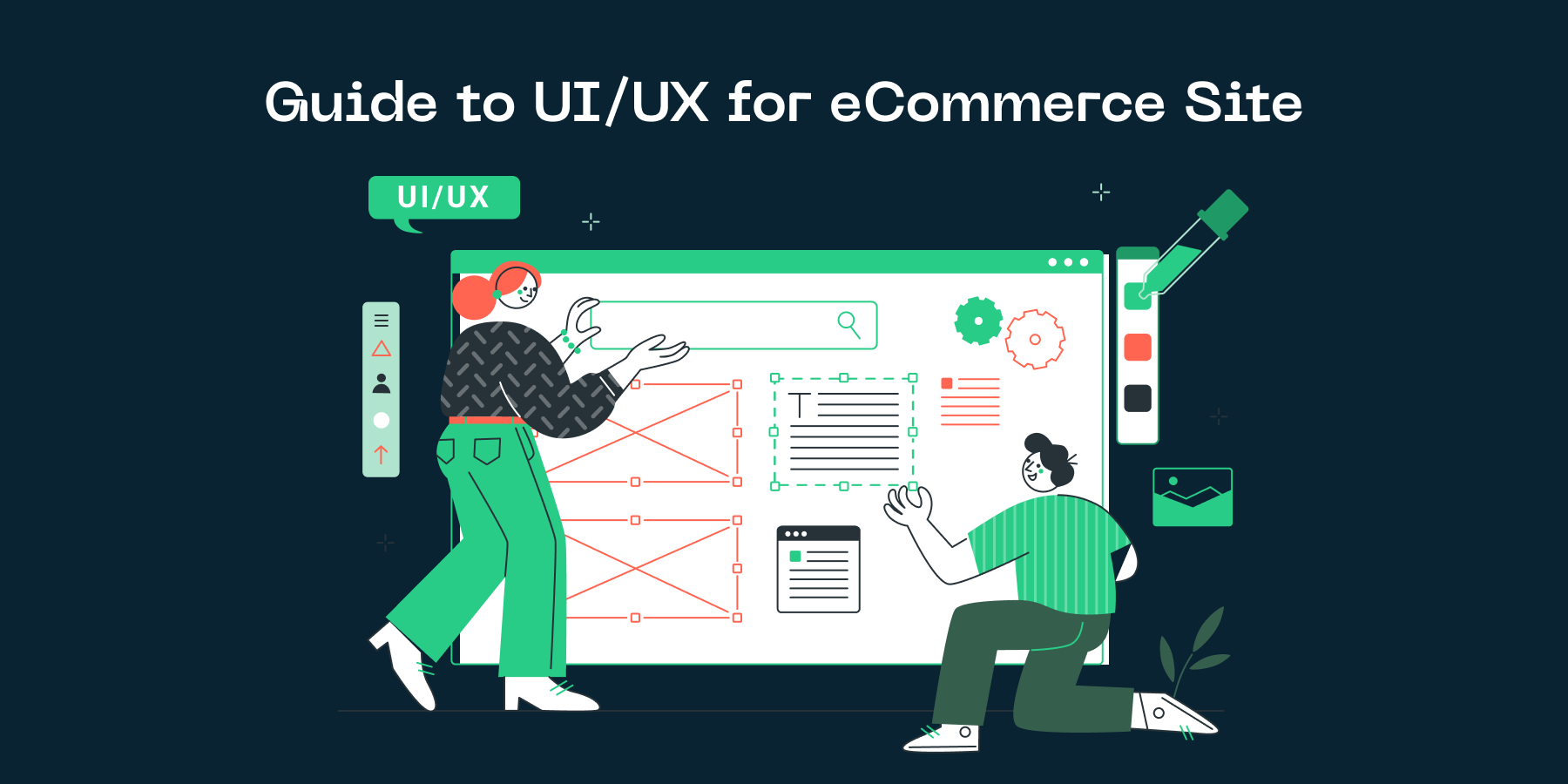
Introduction
Understanding the Importance of Button Design
In the bustling world of ecommerce, the importance of button design on a website cannot be overstated. As a store owner or marketer, you may be wondering why something as simple as a button warrants attention. This introduction aims to shed light on this often overlooked aspect of UI/UX design and emphasize its significance in boosting conversion rates.
Simply put, buttons are the stepping stones that guide visitors through your website. They encourage action, whether it be making a purchase, signing up for a newsletter, or filling out a form. The design, color, size, and placement of these buttons play a crucial role in influencing the decision-making process of visitors. An optimally designed button can be the push a visitor needs to transform into a customer.
Understanding the importance of button design is the first step towards optimizing it. A well-designed button is not just aesthetically pleasing, it serves its purpose effectively by clearly communicating its function, grabbing attention, and prompting clicks. This might seem like a minute detail in the grand scheme of your ecommerce site, but it is these minute details that come together to create a seamless and intuitive user experience.
The Role of UI/UX in eCommerce
The role of UI/UX in eCommerce cannot be underestimated. UI (User Interface) and UX (User Experience) are crucial for any eCommerce website as they play a significant role in affecting the conversion rates, thus directly impacting sales and revenues. A well-thought-out, intuitive design not only enhances the overall user experience but also guides users through the buyer journey, encouraging them to complete the desired actions and transactions.
UI is all about how the eCommerce site looks and feels, from colors, shapes, and sizes, to placement of elements on the page. In essence, UI is the visual layout of the site. A well-designed UI facilitates user navigation and interaction with the site. This is where optimizing button design comes into play. The design and placement of these buttons can significantly impact a user's interaction and consequently, conversion rates. Buttons that are too small, poorly placed, or visually unappealing can deter users from making a purchase.
On the other hand, UX is about how a user interacts with, and experiences the eCommerce site. It involves understanding your users, their needs, values, abilities, and limitations. A positive UX design ensures customers can easily find what they are looking for and have a seamless shopping experience. This in turn increases the likelihood of repeat visits and customer loyalty. Therefore, a comprehensive UI/UX guide is not just about aesthetics, but also about creating a functional, user-friendly eCommerce site that drives conversions and encourages customer loyalty.
Basics of Button Design
Elements of Effective eCommerce Button Design
Getting the basics of button design right is crucial for any eCommerce site. When designed effectively, buttons act as visual signposts that guide users towards desired actions, such as purchasing a product, signing up for a newsletter, or downloading a resource. Thus, button design is a key element in optimizing an eCommerce website's user interface (UI) and user experience (UX), ultimately driving conversions and sales.
There are several important elements to consider when designing buttons for your eCommerce site. First and foremost, buttons should be large enough to be easily clicked or tapped, especially on mobile devices. Yet, they shouldn’t be so large that they overwhelm other elements on the page. The color of the button is equally important. It should stand out from the rest of the page, attracting users’ attention without clashing with the overall website design.
Clarity is another crucial element of effective button design. Each button should clearly communicate its function to the user. This can be achieved through the use of concise, action-oriented text. For example, instead of simply saying "submit", a button might say "add to cart" or " download ebook". Finally, buttons should be placed logically within the flow of the page, preferably near the related content or at the end of a form or section. By following these principles, you can create buttons that not only enhance your eCommerce site's usability, but also effectively encourage conversions and boost your bottom line.
Common Mistakes in Button Design
One common mistake in button design is disregarding the significance of button color and contrast. The color of a button can greatly impact the user experience, and ultimately, the conversion rate. For example, a button that blends with the background color of the page might become virtually invisible to the user, drastically reducing its effectiveness. On the contrary, a button that stands out by using a contrasting color can immediately grab the user's attention, leading to a potentially higher click-through rate. Hence, button color and contrast should be carefully considered in your UI/UX strategy for your eCommerce site.
Another commonly overlooked factor in button design is the button size and spacing. A button that is too small can be difficult for users to click on, especially on mobile devices. Similarly, buttons that are too close together can lead to accidental clicks on the wrong button, which can frustrate users and lead to a poor user experience. Hence, it is critical to ensure that your buttons are of an appropriate size and adequately spaced. Remember, in your quest for an optimized eCommerce platform, button size and spacing are as important as their aesthetic appeal.
The third common pitfall in button design is ignoring the importance of button text. The text on a button serves not just as an instruction, but also as a call to action. Vague or ambiguous button texts can leave users confused about the button's function, thereby decreasing its effectiveness. Always ensure that the button text is clear, concise, and actionable. In other words, every button text should clearly tell the users what will happen when they click the button.
Advanced Button Design Techniques
Using Color and Shape Strategically
The strategic use of color and shape in button design can significantly impact the success of your eCommerce store. Understanding the psychological impact of colors and shapes can guide customers' actions, leading to increased conversion rates. For example, colors like green and blue often evoke feelings of trust and calm, making them excellent choices for buttons related to purchasing or account creation. On the other hand, colors like red and orange may incite urgency and passion, making them perfect for clearance sales or limited-time offers.
Shape, while often overlooked, plays an equally significant role in button design. Round-edged buttons are often seen as more friendly and inviting, while sharp-edged buttons can convey a sense of modernity and efficiency. However, it's important to keep consistency in mind. Irregular or inconsistent button shapes can cause confusion and frustration, leading to a lower conversion rate.
Remember, there is no one-size-fits-all solution. The optimal color and shape for your buttons will depend on your brand personality, target audience, and the specific action you want to encourage. Therefore, it's advisable to experiment with different colors and shapes, using A/B testing to determine what works best for your eCommerce site. This strategic approach can ultimately lead to a significant boost in your conversion rates.
Implementing Size and Location Effectively
Implementing size and location effectively is a crucial aspect of advanced button design techniques. It directly impacts the user experience and can significantly affect your conversion rate. The size of your buttons should be large enough to catch the user's attention, but not so large that it detracts from the overall design of your website. In particular, the "add to cart" button should be one of the most prominent buttons on your page, as it is the gateway to conversions. It's worth experimenting with different button sizes to see what works best for your particular audience and product range.
Location is another critical factor. The buttons should be positioned in intuitive places where users would naturally expect them to be. For example, the "add to cart" button should be located near the product image and price. Moreover, it's essential to maintain consistency in button placement across your site. If a button is in the top-right corner on one page, it should be in the same place on all other pages. This creates a sense of familiarity and ease for the user, making the buying process seamless and intuitive.
The aim is to make the buying process as straightforward and effortless as possible. Effective button design, including optimal size and location, can significantly contribute to this. It can make the difference between a user making a purchase or leaving your site. So, it's worth investing time in getting the design just right.
How AI and Data Analysis Can Optimize Button Design
Role of AI in UI/UX design
One of the most significant advancements in UI/UX design is the integration of Artificial Intelligence (AI). AI technologies have transformed the way we approach design, especially when it comes to crucial elements like button design on eCommerce websites. Harnessing the power of AI and data analysis, we can construct intuitive, user-friendly interfaces tailored to individual customer needs.
AI in Button Design
AI algorithms can analyze user-interaction data and provide insights into how customers interact with different button designs. By examining factors such as click-through rates, time spent on pages, and user navigation patterns, AI can help designers identify what works and what doesn't. This can lead to optimized button designs that enhance user experience, improve website aesthetics, and ultimately increase conversion rates.
Data Analysis and Optimization
Furthermore, data analysis plays a pivotal role in improving button design. By collecting and analyzing data on user behavior, designers can make data-driven decisions to optimize button features like color, size, shape, and placement. This level of customization can significantly enhance the UX, leading to increased user engagement and business growth. AI-driven data analysis ensures that every design decision is backed by solid data, leaving no room for guesswork or subjective preferences.
Leveraging Data for Better Design Decisions
In the competitive world of eCommerce, making informed design decisions is crucial for success. Incorporating data into these decisions not only enhances the effectiveness of your site's design but also optimizes user experience, leading to improved conversion rates. Leveraging data analysis and artificial intelligence (AI) can provide invaluable insights into how to optimize key elements of your site, such as button design.
One of the most important aspects in any eCommerce site is the design and placement of buttons. Buttons serve as calls-to-action and guide user interactions. Therefore, it is vital that they are designed optimally. AI algorithms and data analysis can be of great help in this regard. By analyzing user behavior, these technologies can provide a clear picture of what works and what doesn't when it comes to button design. For instance, they can determine the best color, size, placement, and text for the buttons that leads to the highest conversion rates.
Leveraging data for better design decisions is a strategic move that every eCommerce store owner or marketer should consider in order to boost their conversions. By using AI and data analysis in optimizing button design, you are investing in a data-driven approach that not only improves the aesthetics of your site, but significantly enhances your user experience and conversion rate.
Conclusion
Key Takeaways
Optimizing the design of your eCommerce site's buttons can have a significant impact on your conversion rate. The user interface (UI) and user experience (UX) of your site directly influence customer behaviour, so it's essential to consider every detail, including button design.
Notably, the size, color, and location of your buttons can greatly affect the visibility and usability of your site, thus influencing the customer's decision to make a purchase. Furthermore, the text on your buttons should be clear, concise, and action-oriented, encouraging customers to click and proceed with their purchase. It is also vital to ensure that the buttons are responsive and function optimally on different devices and screen sizes.
Finally, don't underestimate the power of A/B testing. This can provide invaluable insights into the preferences of your customers, allowing you to make data-driven decisions regarding your button design. Remember, a well-designed button can be the difference between a potential customer leaving your site and making a purchase. Therefore, always strive to optimize your button design to improve the UI/UX of your eCommerce site.
Steps to Implement Optimization Changes
In conclusion, implementing optimization changes to your button design is a systematic process. The first step is to conduct a thorough audit of the current state of your website's buttons. Through this, you can identify areas that need improvement. The audit should consider crucial factors such as the colours, sizes and positioning of your buttons. It's not just about how pretty they look; it's also about how well they guide users to complete desired actions.
The next step is to apply the necessary changes based on the findings of your audit. This could range from adjusting the colour contrast for better visibility, to altering the text inside the buttons to make it more compelling. Remember, the goal is to make it as easy as possible for your customers to navigate and complete transactions on your site.
Finally, you must consistently monitor and test the impact of these changes. Use tools like A/B testing to compare the old design with the new one and see which performs better. This will allow you to refine your UI/UX strategy and make data-driven decisions that will ultimately boost your conversion rates.